Tuesday, 29 May 2012

Module 6, Chapter 7


MODULE 6, CHAPTER 7 - Use of disolvable fabrics


I enjoyed using the dissolvable  fabrics, because you never knew what would happen when you finally unpinned them.  A lot of them came out quite different from what I thought they would be, but I can see that they have a lot of interesting potential. Now all I need is time to try them out!

_________________________________________


No. 1 - Madeira cold water soluble (Gillsew).  Easy to dissolve, quite stiff.


No. 2 - Aquafilm. Very easy to dissolve. Used in frame.


No. 3 - Romeo (thick film).  Can use without a frame, but use a ball-point machine needle. Result is much softer than other samples, but it distorts a lot, so it has to be very firmly pinned out. It takes a long time to dissolve. It is very difficult to write on the film either with a ball-point pen or a pencil, so use a felt-tip pen.


No. 4 - Hot water dissolvable fabric (blue). Hard to dissolve. Samples distorted a lot when the hot water was poured onto them. The heavily machined sample didn't distort at all, but shrank in size.


No. 5 - Trick film. Needs to be ironed off. Very difficult to dissolve.  I finally put it under the grill, and cut out the excess!


No. 6 - Guiliette (thin film). Cold water soluble. Easy to sew on and dissolves well, but distorts when wetted, so pin out carefully. The end result is nice and soft.


No. 7 - Cold water soluble paper. Has a tendency to tear if sewn over. and is very difficult to dissolve.


No. 8 - All these samples were on aquafilm (cold water soluble).

                  A                      B                     C                 D
            8+2+4+6           3+10          3+2+8+4       2+9+1


                 E                             F                           G
           2+9+6+3              2+6+9+4            2+3+9+10


                   H                              I                           J
          2+3+9+10+12              3+10           2+9(zig-zag)


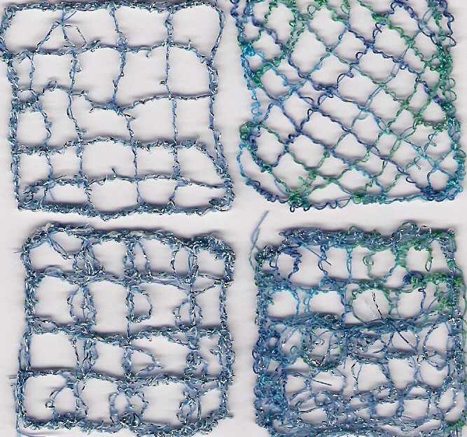
No. 9 - Soluble lace samples based on sea and sky drawings.


A
Cable stitch, zig-zag with trapped pieces of fabric. I was quite pleased with this one, the colours  were attractive and there is a real  feel of waves.


B
Whip stitch, straight and zig-zag.
The background is too heavy,and also too dark for sky. The whole thing feels a bit ominous! Perhaps it's going to rain! 


C
Whip stitch and zig-zag with trapped bits.
I used a twin needle hoping it would look light and airy but you can't see a double line at all, and it came out quite heavy.


D
Straight stitch and zig-zag on a fabric background.
The fabric background held the whole thing together and made it easier to sew, but it lost the see-through element.


E
Straight stitch, cable and zig-zag.


F
Whip stitch,straight stitch and cable stitch.
With the dark blue diagonal lines I was trying to reflect the dark blue diagonal lines of the background, but they came out much too dark and heavy and overshadowed the main light blue wavy lines.


No. 10 - 3-Dimensional shapes. 


1

I made these three 3-dimensional shapes, but didn't realise how hard it is to manipulate the fabric while it is wet.  You actually have to leave it quite a long while until it's almost dry, but still sticky - not easy.  So I was pleased I managed to get anything at all. 

 1A


 1B


 1C(a)


I think this one was the most successful.  I wrapped it round a pencil and then my finger, but couldn't get it off, which is why there is a little knob at the bottom.


1C(b)


Monday, 5 March 2012

Module 6, Chapters 5 and 6

MODULE 6, CHAPTER 5 - MACHINE STITCHERY

Dear Sian,

I imagine that you thought you would never hear from me again, but at long last here is some more work.  I'm sorry it has taken so long coming, but we have been doing a lot of travelling, and it is impossible to do any machining while we are away.  They don't let you use a sewing machine on an aeroplane! So here is some stuff from Module 6.


No. 1.  I did this as a practice piece on muslin, mostly ziz-zag, and thought I would get nice big holes around the stitching, but it didn't come out like that.  Why?

 
No. 2.   This is also a practice piece, and the same thing applies.  How can I get the holes bigger?


No. 3.  These were three pieces of tights stretched on a frame. The top one was very tight, the second loose in the frame, and the bottom one very loose in the frame.  This last one didn't really work, because the loose material kept getting sucked into the machine and getting stuck.  So I gave up!


No. 4.  This was using a twin needle on quite transparent fabric, and I thought you would be able to see the threads very clearly behind the stitching,.  But it wasn't very visible, which didn't give the effect I wanted. Is there anything I can do about that?


No. 5.  Zig-zag and Cable.  I was quite pleased with this. The colours and shapes seemed right, although I am still not really on top of the cable technique. I can't get a nice straight line, and it got quite chunky in places,but I don't think that matters on this particular piece.


No. 6.  Zig-zag.  Although this is padded with quite a thick layer of wadding,  the 'hills'  do not seem to show
up in the photo and, in fact, I hoped it would look more obvious even in the real piece.


No. 7.  Zig-zag.  This came out quite nicely, although I did hope that the holes made by the needle would be larger.


No. 8.  Straight stitch, cable stitch and whip stitch.  This came out much less controlled than in the original, as I still find the cable hard to do, but actually I find the zany quality of the cable stitch quite cute!


No. 9.  Twin needle on transparent fabric. This seems to be the opposite of the previous sample, as the embroidered piece is much more ordered than the crayon picture. Perhaps I am finally learning how to control the machine.


No. 10.  Whip stitch.  This came out as quite a nice interpretation of the crayoning over sequin waste, although it was the reverse side of the machining I had originally done.  Long live serendipity!


No. 11.  Cable stitch on felt, with straight stitch on top to interpret the 'drag' lines of the Markal paintsticks.


No. 11. Straight stitch, cable stitch and whip stitch on shiny fabric.


No. 12. Straight stitch and zig-zag on dyed cotton (procion dyes).  This was one of the first pieces I did, and I was quite pleased with it.  The sewing really seemed to capture the watery feel of the original ink and crayon drawing.


No. 13. Straight, zig-zag and cable stitches on padded felt.  I liked this piece. The colours were attractive and it seemed to have the feel of both sea and sky. This is just half of a piece, the other half will appear in the next chapter.


MODULE 6, CHAPTER 6 - CUTWORK 


No. 1 .  Fabric sewed with zig-zag, second layer sewed with zig-zag cut and frayed.  This came out rather dark, so that it is difficult to see the diagonal lines, which are very light in the original design.  Also the fraying covers the underneath fabric, so you don't really get the idea of the diagonal lines, although the top stitching does emphasise it..


No. 2.  First layer stitched; second layer stitched, cut away and frayed.  There is not enough contrast between the first and second layers, so it all rather fades into one piece of blue.


No. 3.  First layer sewed in zig-zag; second layer sewed in zig-zag with pieces of fabric incorporated and then cut; third layer stitched with spirals and whip stitch, cut and frayed.  When I put on the second layer and stitched it, it seemed altogether too bright, so I put on the third layer to tone it down a bit.  But I then lost the horizontal lines and the feel of the wavy pattern, so it looks messy.


No. 4.  Background fabric stitched with whip stitch; second layer (dyed dishcloth) sewn with spirals and whip stitch and cut.  I liked this better. The colours were right and it had a 'sky' feel.


No. 5. First layer stitched on padded felt, straight stitch, zig-zag and cable.  Second layer straight stitch and zig-zag, cut away and frayed.  This is the other half of the piece (No. 13) in Chapter 5, but with an extra layer incorporated and frayed.  Although I like the first piece, I think the extra layer gives it more depth.